As Western brands expand into Japan, they now face the challenge of appealing to culturally diverse audiences. Your online appearance is crucial for success, and understanding Japanese web design expectations for the local market is key – probably more so than anywhere else.
In This Article
In this article, we’ll cover the state of Japanese website design in 2025, and what this means for brands entering the Japanese market.
The Evolution of Japanese Web Design
Japanese website design has endured a longstanding reputation for being quirky, at times off-putting, and downright confusing. In the past five years, however, a shift has occurred. Japanese websites are becoming much more globally appealing but still maintain the unique characteristics their visitors have come to expect.
As you eye breaking through into the Japanese market, how you design your website is, perhaps, the single most important factor in determining how audiences will respond.
Text Avalanche: The Most Noticeable Japanese Website Design Feature
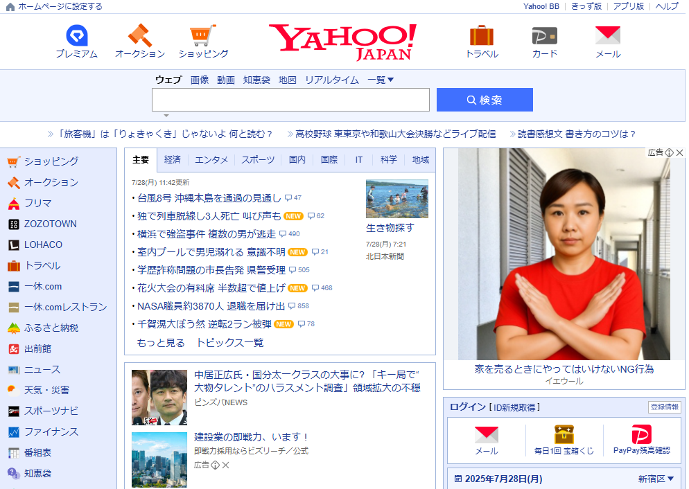
For years, when foreigners visit Japanese websites, perhaps the first thing that stands out is the sheer volume of text displayed.
This is one feature that will likely not change any time soon. Just look at the Rakuten and Yahoo! Japan homepages for proof. This is because Japanese users appreciate detail, trustworthiness, and transparency, hence informative sections and layered content.
However, for many Japanese websites, the presentation of text has matured in the form of bullet lists, collapsible sections, as well as micro-interactions like hover effects. This allows Japanese audiences to get the amount of information they’re accustomed to, but in a way that’s not overwhelming younger visitors or alienating to those who might not be local.
Notable Trends in Japanese Web Design for 2025 and Beyond
While the issue of text density continues to be a struggle between practices of the past and the evolving changes of the present, many other aspects of Japanese website design are aimed toward a new future.
Bento Grids & Modular Layouts
Modern Japanese web design embraces bento-style layouts—modular content blocks inspired by the organization of bento boxes. These grid systems create a clean, scannable experience, improving usability across desktop and mobile.
Scroll-Based Storytelling to Optimize Engagement
Also known as “scrollytelling,” this trend remains popular and effective, and is finally catching on in Japanese web design. Scroll-triggered animations help tell a compelling brand or product story.
This design style increases user engagement and helps complex content feel more immersive and intuitive.
Expressive Typography in Modern Japanese Websites
Japanese websites are moving beyond basic fonts. Designers now use custom Japanese typography that combines Kanji, Katakana, and Latin scripts for a bold, expressive visual identity. Type has become a key part of brand storytelling online.
Branded Illustrations Are Replacing Stock Imagery
Brand identity is key to grabbing the attention of consumers. This is where Japan’s “quirk factor” is on clear display. To stand out, many Japanese websites use custom illustrations, mascots, and animated visuals tailored to their brand.
This marks a shift away from stock photography gives sites a unique voice and strengthens emotional connection with users.
Accessibility and Inclusivity in Japanese Website Design
There’s a growing focus on accessible Japanese web design, including color contrast standards, keyboard navigation, and voice support. More websites now offer multilingual content and user-friendly experiences for diverse audiences.
How Should Western Brands Design Their Japanese Website?
While Japanese web design is moving in a direction more familiar to Western sensibilities, there is still a “Japan element” to consider. Keep these pointers in mind when strategizing your website creation and localization efforts.
- Localization Is More Than Translation – Simply translating your English website isn’t enough. Brands should adapt content, visuals, and UX that caters more intently to a Japanese audience.
- Combine Simplicity with Detail-Rich Layouts – Japanese users will always expect thorough explanations, but in a layout that’s easy to scan. Incorporate the aforementioned modular layouts and Bento-style grids to organize detailed content effectively.
- Typography and Layouts Should Be Japan-Optimized – Font choice, character spacing, and reading flow affect trust and usability. Native Japanese fonts like Hiragino or Yu Gothic are reliable, and adjust spacing and line height for optimal readability.
- Micro-Interactions Are a Must in Japanese UX – Hover effects, and scroll-based storytelling. These are not just trends—they’re standard in competitive Japanese web design. Consider including these interactive elements to build engagement and convey professionalism.
- Responsive and Accessible Design Is Essential – With mobile-first users and growing expectations for inclusive web experiences, responsive and accessible design is non-negotiable in Japan.
- Build Trust by Remembering the Basics – Japanese users expect detailed content even in the mundane details. Include comprehensive information about who you are by providing FAQs, support options, and local testimonials to build user confidence.
Info Cubic Japan: A Veteran Agency in Localized Japanese Web Design
To thrive in Japan’s digital market, Western brands must treat localization as a strategic UX and design effort, not just a language project.
Embracing the latest Japanese web design trends can dramatically improve engagement, conversion, and brand trust. That’s where Info Cubic Japan steps in.